...
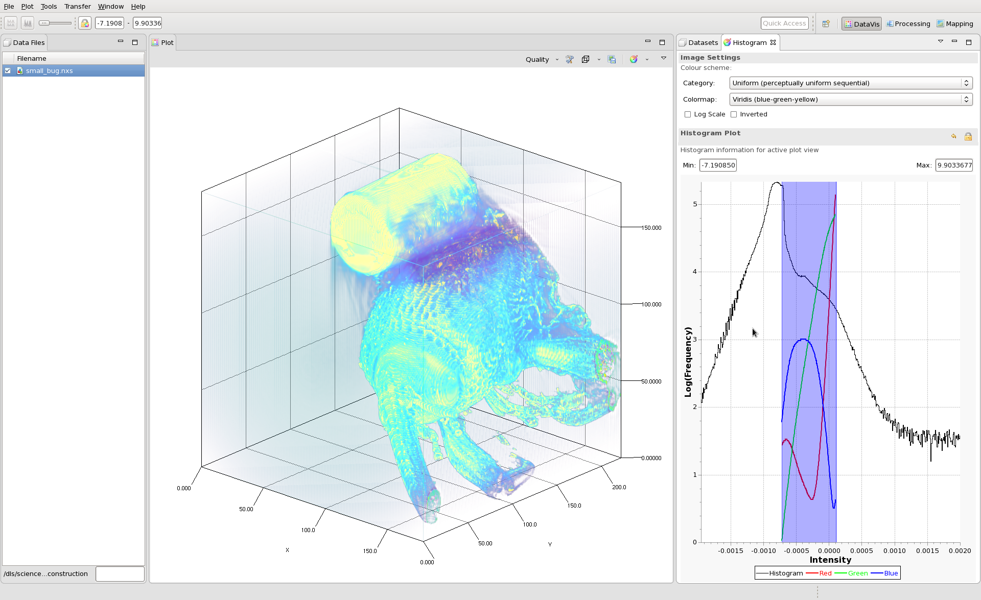
The Histogram tool shows a plot of the histogram of the data values with a blue box that shows the minimum and maximum values used for the colormappingcolor mapping. The min/max values can be changed by dragging the blue region or changing the values in the min and max text fields.
Once the color mapping is set, the image can be saved as a png using the button on the plot toolbar.