...
Header bar: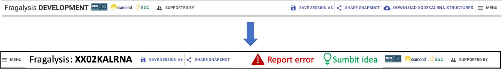
Report: two prominent buttons, “Report error” (red), “Submit idea” (green)
Target name big and bold
Order along top: menu || Fragalysis: <target name> || session buttons (later “project”) || report buttons || logos etc.
Logos that are links should change the pointer (to a hand)

Site info in cluster navigatorDefaults on entry:
White background
Activate biggest cluster by default (most fragments)
Show all ligands in 3D viewer
Show complex of first ligand
(lazy loading of ligands?)
Remove download YANK button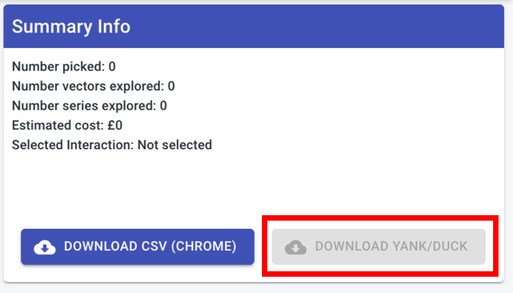
“
Clear selection” button: clear the filtersViewer controls:popup behaviour - like Office property editor
get rid of header,3 buttons tight together
Automatic depth queuing - (pass them the backend code?)
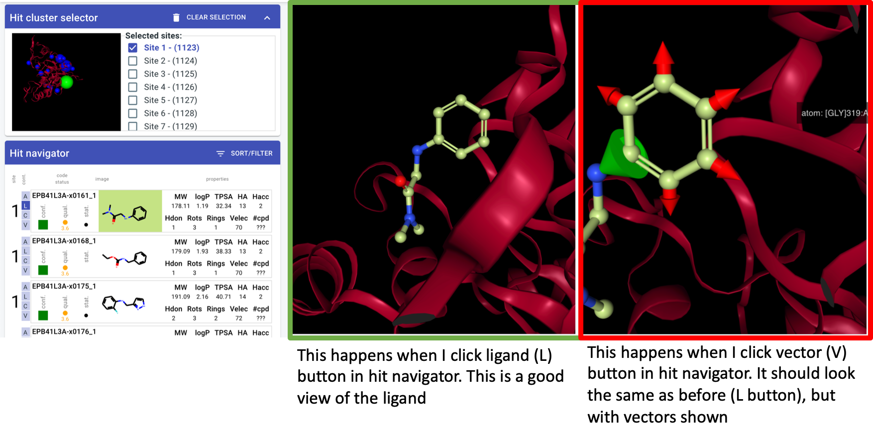
orientation algorithm - v1: look down vector from centre of mass through centre of site
whatever the algorithm: should be consistent for a site regardless of which hit I click on
Hit navigator: layout(another mock-up)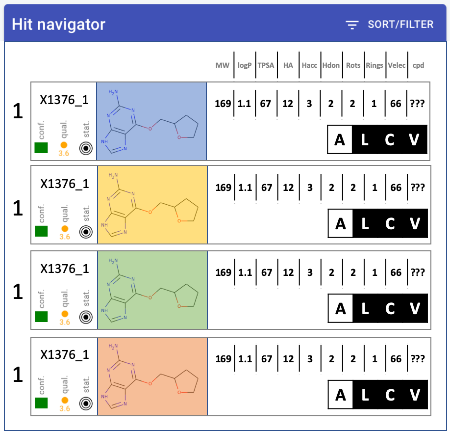
quality metrics - MUCH narrower, squish into single icon-letCompound much bigger, at least 2x widerChange properties into table: only one header at top, single rowRemove target name from labelNumbers - decimal points. none: MW, TPSA. one: logP#cpd - make it work - move to backend
#vectors - total (pickable)Velec - wrong number?
add electron density selector
display toggles: better contrast (check ICM, suggest you copy)
Hit navigator: drop-down to colour red thevalueoutside rule of 3 or 5 or none - left of sort/filter button. Default: rule-of-3.Sort-filter behaviour: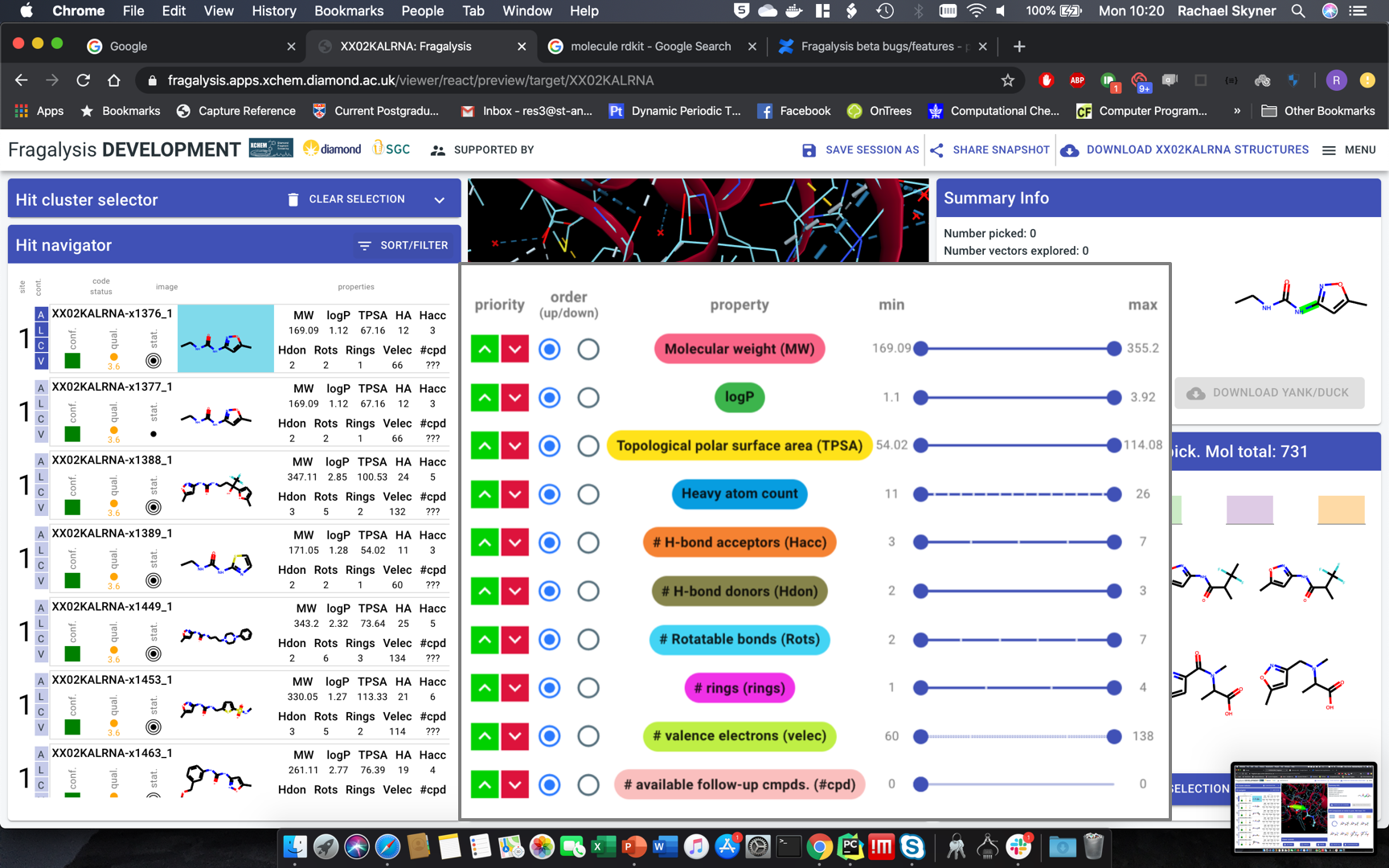
slide out modal over 3D pane,withoutinactivating whole pageapply changes instantly, not on “apply”everything should remain active - just slide in-out.third the width (less than half): squish all icons, labels two rows if necessary, sliders far narrower
Hide all button in hit navigator - stay in site and 3D view
Compound picker
First compound in list: spinning wheel
Highlight constant part - RDkit command
Header text: “<vector label>: <#cpds> available (total for molecule: <#total cpds>”Vector label: backend, for now human readable atom label straight from RDkit if that exists
if not: “vector 5” by whatever arbitrary sequence
ideally: can RDkit generate “alpha imine” or similar?
(the least amount of work possible)
Convert to table - exact same layout (and data) as hit navigator - including sort/filter
except quality things and label
sort/filter - slide out to left, but over 3D view)
display options: all, ligand, complex, vectors (hooks at least)
check-box on left - keep highlight of row if checked
by all means leave colours.
3D view - make it work
Header bar:Janssen logo
“supported by” - pop out a modal
(back-button from “supported by” resets the view - BUG. but eliminate through modal)
update logos in “supported by page”: ULTRA-DD, IMI, Horizon 2020,
...